Ok…ok…I know it’s been a while since I have posted any artwork! The work I am doing now is just for fun! I am experimenting with mediums, colors, techniques…even using oil and acrylic like you’re not supposed to…I don’t know why, but for some reason I break rules when I am painting…I am such a good little girl otherwise, I swear!! But when I paint, just tell me not to do something…and I am going to do exactly that (whatever THAT is!) next!
So, it is common knowledge that you can paint with oil on top of acrylic…painting with an oil-based paint on top of a water-based paint is possible…but painting with an acrylic (water-based) paint on top of an oil-based paint is vervoten…forbidden…well, impossible…the water-based paint (could be watercolor also) will bead up on top of the oil paint…so, of course, I had to try it out in my own way this last week…
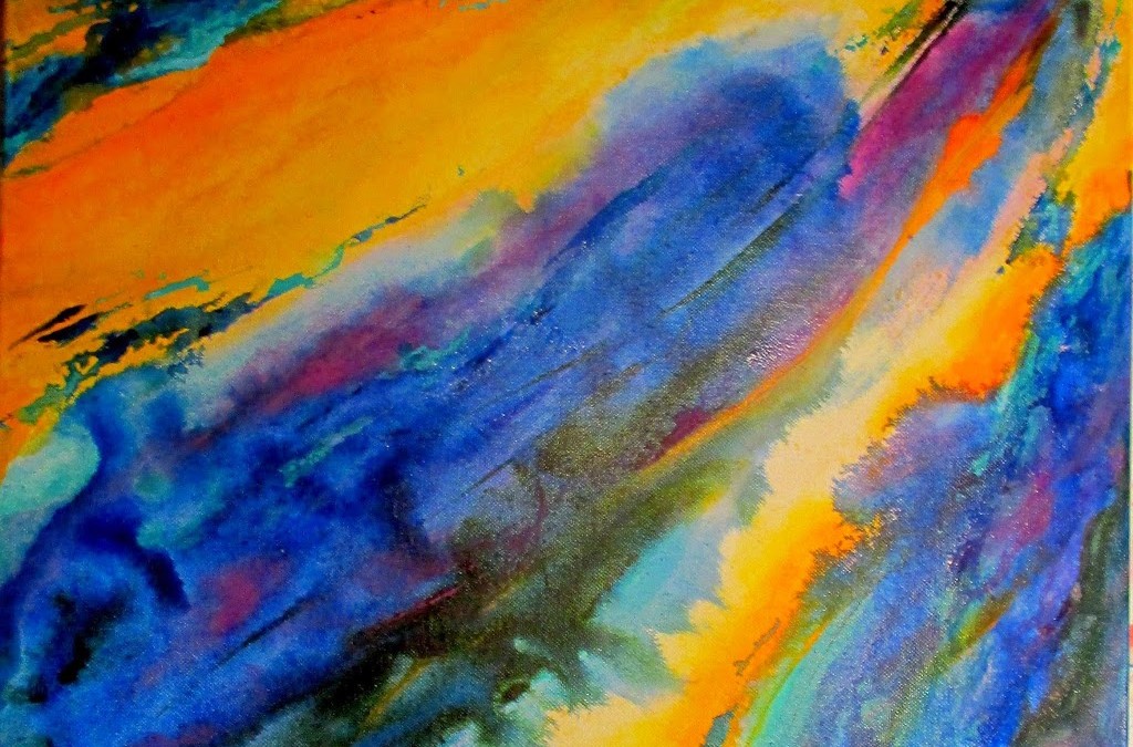
First of all, I was experimenting with “flow”…or some may call it a “pour”…acrylic paint used with a “pour medium”, which extends the “flow” of the paint across a piece of paper or a canvas…of course, just the idea of using watercolor techniques across a canvas instead of paper (canvas has all of those little holes caused by the weave that the paint tends to fill up)…well, let’s just say that canvas has some problems when using watercolor techniques on it, but I love the outcome so I do it anyway! …but then try to make paint flow across a whole bunch of teeny holes, each one catching its own little share of precious pigments with the fluid its suspended in….well, it’s not easy to get that “flow” flowin’!!! …but these images show the results…

I love the soft appearance of the “flow”! Colors mingle with others forming new ones…in this case, blue and yellow come together to make green… when doing a “pour” with transparent colors such as the ones I have used, the paints almost seem to glow…they’re alive!…they reach out and grab you by the collar and demand you enjoy the almost gem-like brilliance…of course, I used a couple of opaque colors also…the purplish color and the turquoise…they also add to the mix.
I did the pour in the middle of the canvas…then I used a white oil paint stick along the sides of the pour, fingerpainting it on so that it would be soft also…I think you can see the white paint from the oil paint stick fairly well… it did definitely make the acrylic paint which I put on top of the oil stick bead up…so I just painted around it with the acrylic paint…and wiped up the beads of paint that appeared…

I love complimentary colors on the color wheel, so I added some pours of different colors of yellow to offset the blues I used…I wanted another punch of color so I added the orchid color…on the color wheel yellow is opposite purple, so they are “complimentary”…and orange is opposite blue, so they are “complimentary”…
BTW, Pantone(a paint co. that makes paints for walls) has proclaimed “Radiant Orchid” to be “color of the year”! …that’s the color of purple I used in this painting…although I mixed it with my own paints…

Well, it has been fun to play with the light molding paste, which I also used in this painting…also the flow medium, the oil paint stick, the different colors, different techniques…I hope that you have enjoyed seeing the results of my experimentation! Thanks for visiting!!

We need to paint together Nina! I love working this way all the time….:-)
I love painting this way Nina – we should get together and paint sometime! What fun!
Very bold! I love the colors!
thanks, Nancy! I would LOVE to paint with you…will have to schedule a painting event next time I am in AZ!!!
Kelly, I just found your comment…thank you for the compliment! It seems I prefer those bold colors these days! …and painting in ways that are very loose and free…thanks for your comment, Kelly!!!